Landing pages with low conversion rates are a huge contributor to performance marketing inefficiency.
Factors like your industry, product, and target audience play a huge role in determining your landing page conversion rate. But it’s still useful to have some ballpark figures to benchmark your performance. According to data collected by WordStream across all industries:
- The average (median) conversion rate for a landing page is 2.35%.
- The top 25% landing pages convert at 5.31% and above.
- The top 10% landing pages convert at 11.45% and above.
- The highest performing landing pages convert at 20% or more.
Before we jump in, make sure to check out Chris Nightingale's episode of the Paid Media Lab, where he went in-depth on his bulletproof strategies for creating high-converting landing pages:
Chris strongly believes in the power of landing pages to turn curious clickers into long-term customers. His years of experience doing just that make this a highly valuable watch for anyone looking to get inspiration from the best in the business.
Following that, here are eight landing page design tips that will help boost your landing page conversion rates.
1. Use the 1-1-3-1 rule
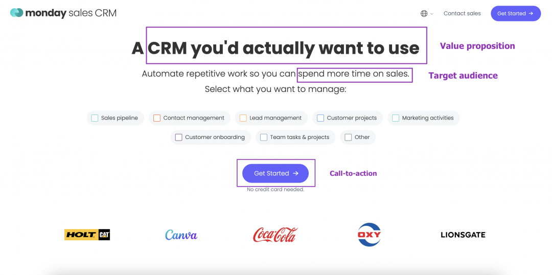
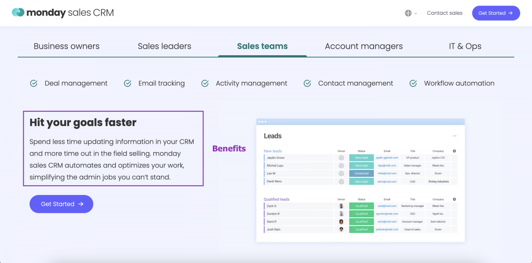
Every landing page you create should aim to hook a single target audience with a single overarching message. The 1-1-3-1 rule helps you define your audience and deliver your message in a concise, structured way:
| Elements | Purpose |
| 1 Target Audience | Define your target audience so you know who your page must connect with. |
| 1 Value Proposition | Know what makes your product or service unique, and why it’s the best choice for your target audience. |
| 3 Benefits | Outline three major benefits customers will get from using your product. These should link to your value proposition. |
| 1 Call To Action | Clarify the action you want your target audience to take. |
This page from Monday illustrates how to use the 1-1-3-1 technique in your landing page design:
2. Write to one person, not everyone
You want to get your landing page in front of as many of your target users as possible, so it might seem counterintuitive to write for just one person. But by writing to a single person, you can make your landing page feel more targeted and personal.
This is useful because you can:
- Direct your landing page at the person who’s most likely to buy your product.
- Make readers feel as though you’re speaking to them directly.
- Create separate landing pages with powerful messages for each target user.
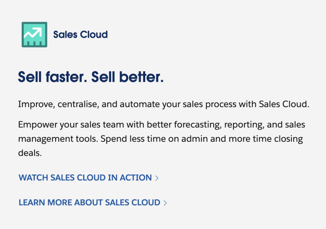
This snippet from a Salesforce landing page illustrates how to communicate effectively with a single user. Using simple language and short sentences to emphasise the benefits for the user builds trust in the brand — there’s no jargon to hide behind, and no need to skim read:
When you’re working on your draft landing page copy, add a screenshot of your ideal buyer persona to the top of the document to help keep them in mind as you write.
3. Replace vague statements with specific information
Don’t assume readers will know what your product can help them achieve. Trade vague statements for specific punchlines that solve common pain points and tell your reader what to expect.
For example, see the difference between these two statements:
The all-in-one automated podcast editing platformShip your episodes 3x faster with AI-powered editing
Both state what the product does in approximately 50 characters. But the second shows the tangible outcome users can get from the product, creating a more powerful, compelling reason to convert.
KarbonHQ, an accounting software, makes great use of stats on their landing page:
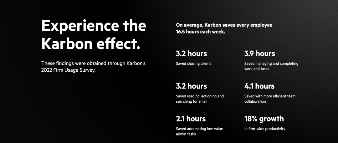
Without making vague claims, these stats prove that Karbon’s software saves time, improves productivity, and therefore reduces costs for their customers.
4. Make H2 subheadings specific to an audience or industry
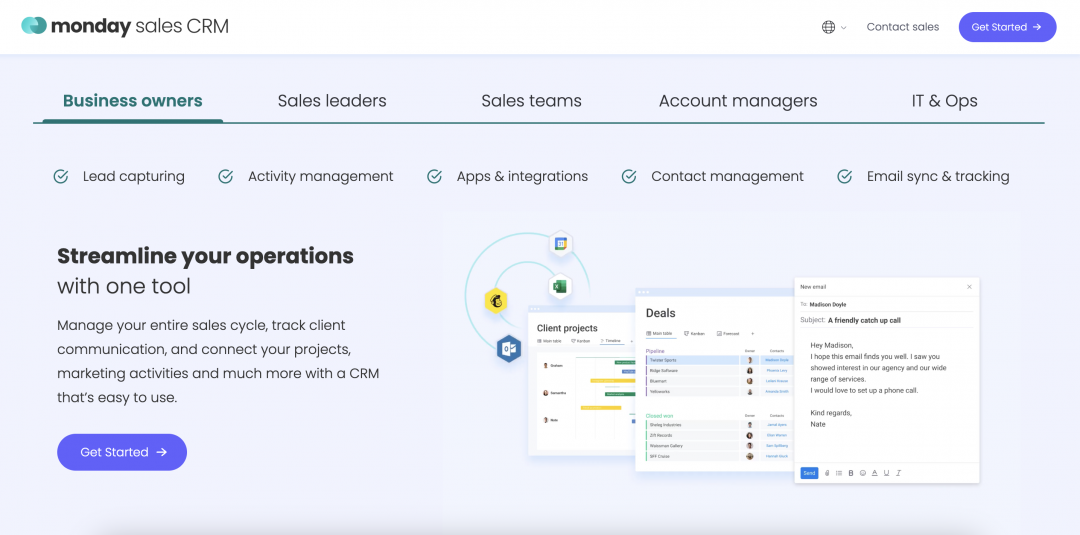
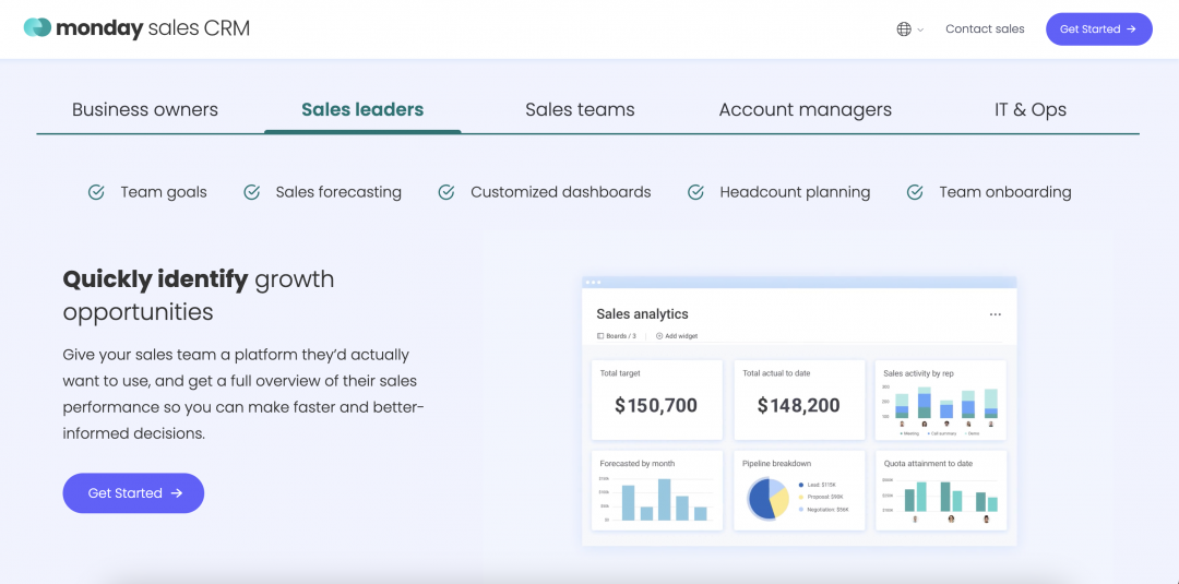
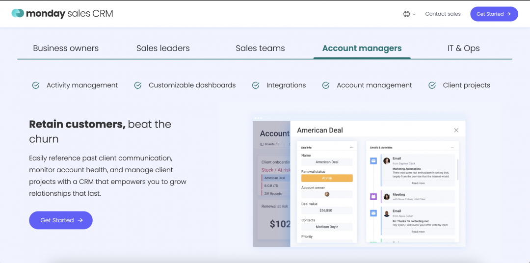
Your landing page subheadings should relate to the specific audience you’re targeting. Let’s take another look at the Monday landing page. They’ve created tabs for each user that might be interested in their product, then created H2 subheadings that speak directly to that user. For example, while account managers are most interested in customer retention, sales managers are more likely to be focused on revenue growth.
Filipe Ferreira, Performance Digital Marketing Manager at Parfois, says:
“Focus on targeting the right audience. Deeply understanding their interests and behaviours can help you create more targeted and effective campaigns, leading to better results.”
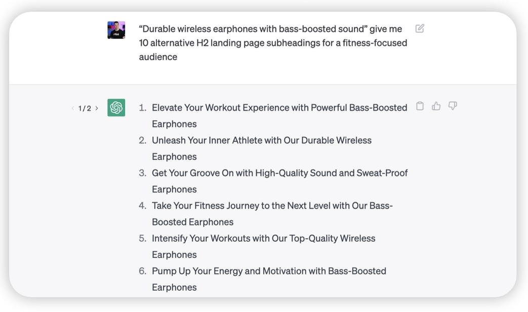
ChatGPT can help you come up with variants for your H2 subheadings. Try the prompt below:
“Product/service” give me 10 alternatives for an [X] target audience
For example: “Durable wireless earphones with bass-boosted sound” give me 10 alternatives for a fitness-focused audience.
5. Use a proven page structure
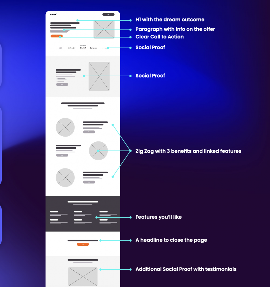
If you’re not sure how to structure your landing page, use the following 9-part structure as a starting point:
- H1 with the ideal outcome — A punchy headline that captures your value proposition in a nutshell.
- Paragraph with offer info — A short paragraph that describes the value of your product for your ideal customer.
- Clear call-to-action — A button to send your potential customer through the buyer’s journey.
- Social proof — Logos of existing customers or clients work well here.
- Social proof — Provide more detail from previous happy customers to build trust with readers.
- Benefits and linked features — Highlight three key benefits of your product, and the features that make these possible.
- Features for your target audience — Put the features that resonate most with your target audience in the spotlight.
- Closing headline and CTA — This is your last chance to get the reader to take action.
- Additional social proof — Provide testimonials or reviews to remind your reader of your success with other similar customers.
6. Build trust in multiple ways
Trust increases the chances of conversion; doubt destroys it. Building trust with your reader is the ultimate way to get them onside with your business and your product. But it’s not easy, especially when there’s so much competition.
Tim Ash, CEO of conversion rate optimisation agency SiteTuners, explains:
"Online trust building is difficult because it has to be done very quickly. When someone shows up on your website, they will form a first impression of your landing page within one twentieth of a second — about the same time it takes to blink. So they already know if your website is trustworthy or not."
Tim Ash
Founder of SiteTuners
Five key elements can help you build trust within your landing page. These include:
- Logo strip of top clients — This sets out your stall as a competitive business that’s already helping other clients succeed. Try to keep these super-relevant to your target audience; if you want to attract retailers, for example, use your biggest retail client logos.
- Genuine testimonials — Include quotes from existing clients (ideally those in a similar position and industry to your target reader) that highlight the value you’ve brought to their business. If possible, include stats and figures (e.g. “We generated 30% more revenue in the first three months of using the product”).
- Your own images (not stock photos) — Using unique branded images lends credibility to your landing page. Instead of relying on stock photos, create your own images that speak to your audience. This can include illustrations, photos, screenshots, and videos.
- Case studies — Case studies offer more in-depth insights into how you’ve helped other customers achieve specific goals. Outline key accomplishments in your landing pages.
- Third party information — Linking your business with sites like TrustPilot and Google Maps shows your company is legitimate. It also gives people the chance to read independent reviews from real customers.
Building trust is an ongoing process, so tailor all your communications to gain the trust of potential customers. This includes your site content, emails, and ads as well as using these landing page design tips.
7. A/B Test your CTAs
Your calls-to-action must be powerful and compelling. So don’t make any assumptions about which you think will convert best without data to back it up.
Creating multiple variants of landing page CTAs and A/B testing them is the best way to gather data about your top-performing calls-to-action. You can test:
- Button design (including size, colour, and text style).
- CTA copy.
- Position on the page.
A/B testing helps you make data-driven decisions that can ultimately lead to a better conversion rate and increased revenue. A simple button wording change can have a big impact on your landing page success.
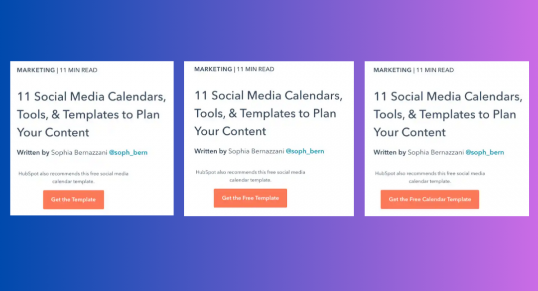
For example, Hubspot tested these three variants of the CTA below, adding the word “free” to variant B and “free calendar” to variant C:
Here are the (somewhat surprising) results:
“Interestingly, variant B saw a loss in form submissions, down by 14% compared to the control. This was unexpected, as including "free" in content offer text is widely considered a best practice.
Meanwhile, form submissions in variant C outperformed the control by 4%. It was concluded that adding descriptive text to the author CTA helped users understand the offer and thus made them more likely to download.”
It’s best practice to test just one variable at a time, so you can accurately monitor and measure the outcomes and optimise based on this data. Remember to A/B test both mobile and desktop versions of your CTAs.
8. Check your page speed
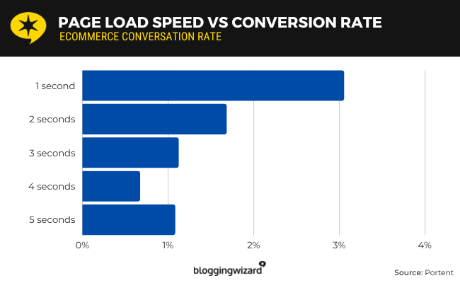
Fast page speeds keep users on your site. Research by Portent found pages that took one second to load had almost double the conversion rate of pages that took two seconds to load:
Slow page speeds can also reduce your Google Ads Quality Score, increasing your advertising costs and potentially resulting in fewer conversions from your ad spend.
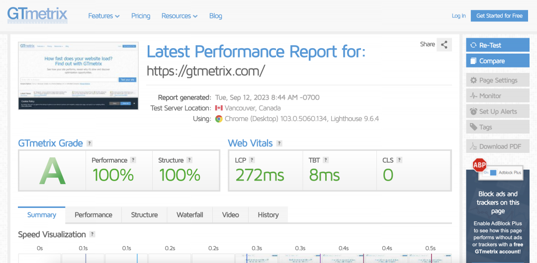
Use GtMetrix to test the performance of your landing page. Aim for an A grade page. If it falls short, look at the report in more depth to find and resolve any page speed issues.
Stop invalid traffic blocking landing page conversions
Poor landing page design isn’t the only reason your page might fail to convert. A high volume of invalid traffic (IVT) can also lead to low conversion rates, even if you have a lot of site traffic.
In fact, our 2024 Wasted Ad Spend report revealed $204.83 billion will be lost in revenue opportunity due to IVT for brands and advertisers in 2024. This indicates the growing scale and cost of the problem: invalid traffic directly wastes ad spend, because those “visitors” never convert to sales.
Lunio click data revealed notable differences in invalid traffic rates across individual channels. These are presented from lowest to highest in the chart below.
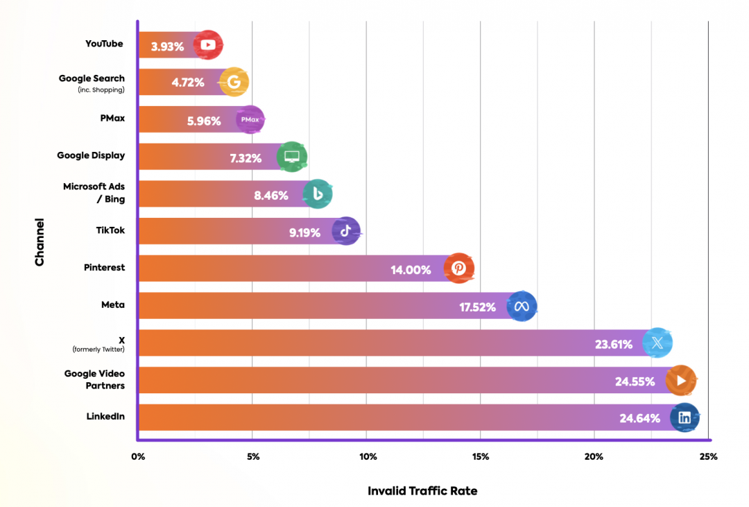
Lunio is designed to block invalid traffic from clicking your ads and entering your sales pipeline. That means they won’t skew your conversion stats or reduce your landing page conversion rate, giving you a genuine picture of your landing page success.


